Harnessing the Power of Microinteractions
Imagine a website that feels alive, responding to your every click and scroll with subtle yet delightful animations. These tiny moments of magic are microinteractions, and they have the power to transform a website from flat and forgettable to engaging and unforgettable. Let’s delve into the fascinating world of microinteractions in web design and explore how these seemingly insignificant details can significantly enhance the user experience.
In the ever-evolving landscape of web design, attention to detail can make all the difference between a good website and a great one. One such detail that has been gaining prominence in recent years is microinteractions. These subtle, yet significant, design elements play a crucial role in enhancing user experience (UX) by engaging visitors and making interactions more intuitive and enjoyable.
Understanding Microinteractions
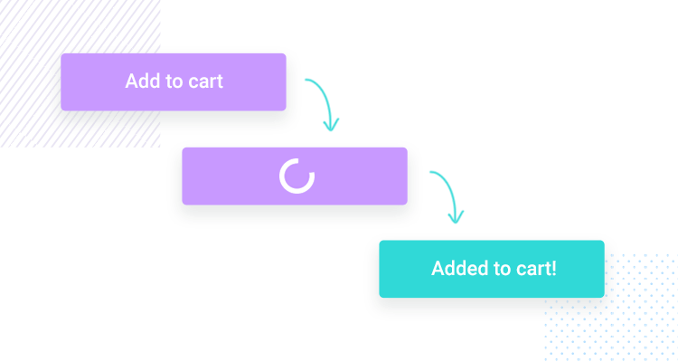
Microinteractions refer to small, single-purpose interactions that occur within a website or application. They are designed to accomplish a specific task or provide feedback to users, often in real-time. These interactions can be as simple as a button changing color when hovered over or as complex as a progress bar showing the status of an upload.

The Power of Subtlety: Guiding Users with Gentle nudges
Microinteractions are the antithesis of flashy animations. They’re the gentle whispers that guide users through a website, not the blaring shouts. Imagine a website with a button that subtly pulses when you hover over it, or a progress bar that fills with a delightful animation as a page loads. These microinteractions provide subtle cues that help users understand how to interact with the website, ultimately improving usability and learnability.
Building Trust Through Feedback: The Art of Acknowledgment
Microinteractions can bridge the gap between user and website. Imagine a website that acknowledges user actions with a satisfying confirmation animation, like a checkbox that smoothly checks itself when clicked. These feedback mechanisms let users know their actions have been registered, fostering a sense of trust and control over their website experience.
Emotional Connections: Microinteractions that Spark Joy
Microinteractions can go beyond functionality and tap into the realm of emotion. Imagine a website with a shopping cart icon that wobbles playfully when an item is added, or a “like” button that bursts into a confetti animation when clicked. These delightful microinteractions can evoke positive emotions, making the user experience more enjoyable and memorable.
A Hierarchy of Needs: Prioritizing Microinteractions for Impact
Not all microinteractions are created equal. Imagine a website that strategically uses microinteractions to highlight important elements or guide users through a complex process. The key is to prioritize microinteractions for maximum impact. Focus on elements that require user interaction, such as buttons, forms, and navigation menus. By strategically using microinteractions, you can ensure a smooth and intuitive user experience.
Keeping it Clean and Consistent: Microinteractions that Complement the Design
Microinteractions should never overshadow the website’s core design. Imagine a website where microinteractions seamlessly complement the overall aesthetic, adhering to the chosen color palette and design language. Consistency is key –– microinteractions should feel like a natural extension of the website’s design, not a jarring add-on.
Beyond the Desktop: Microinteractions Optimized for All Devices
The magic of microinteractions shouldn’t be confined to desktops. Imagine a website where microinteractions are optimized for mobile devices, using touch-specific animations and gestures to create an intuitive and engaging user experience on the go. By ensuring microinteractions function flawlessly across all devices, you can guarantee a positive user experience no matter how users choose to interact with your website.
Microinteractions are a powerful tool that can elevate web design from good to great. By incorporating these subtle yet impactful animations, you can create websites that are not only functional but also engaging, user-friendly, and emotionally resonant. So, the next time you’re designing a website, don’t underestimate the power of microinteractions. These tiny details can make all the difference in crafting a website that truly delights your users.

